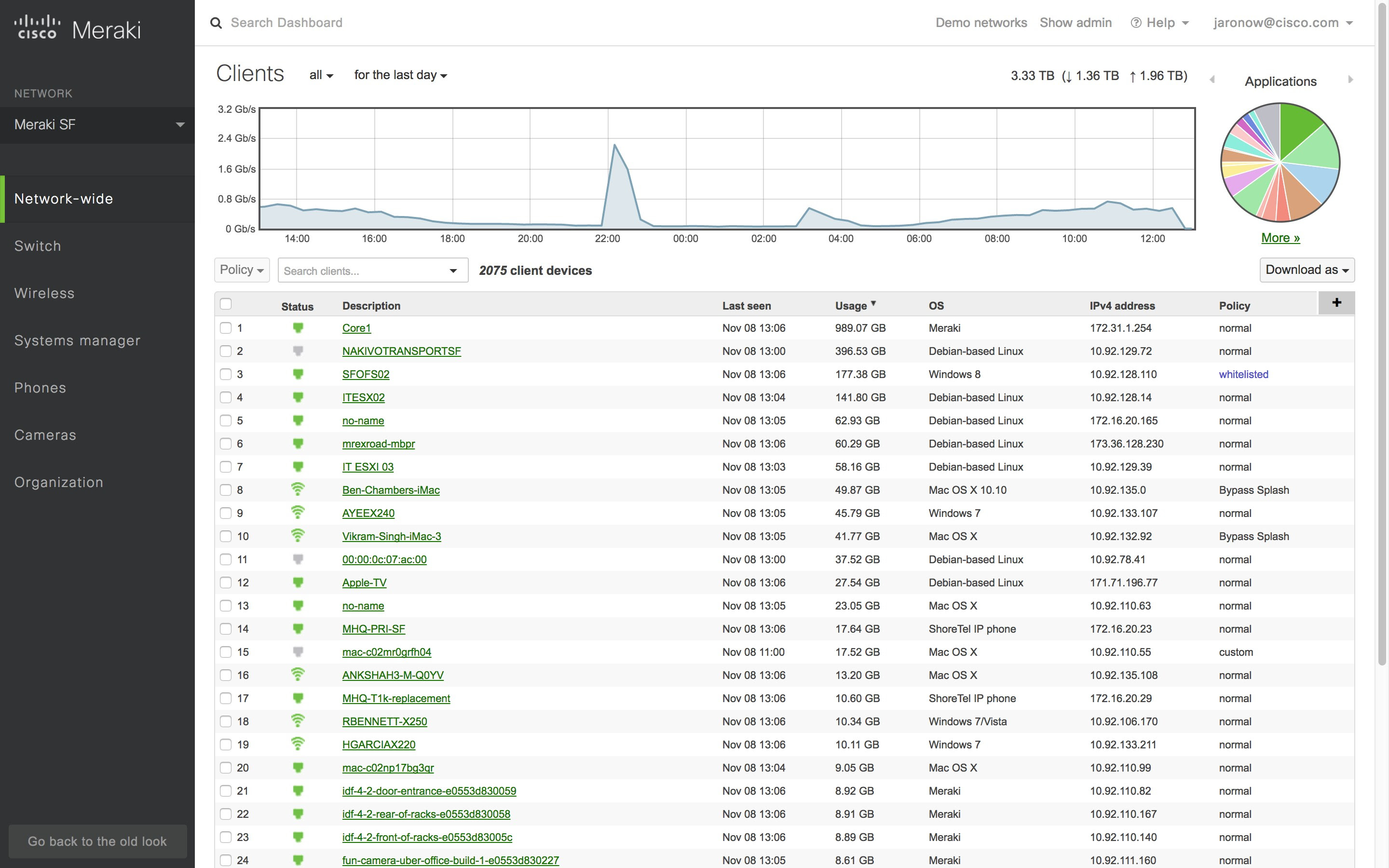
Meraki are excited to announce a brand new look for Dashboard.

The first thing most users will probably notice is that the navigation menu has changed colors, making the menus more distinct from the pages themselves. However, there are several more subtle changes to the new view. For one, the help section is now found at the top right to make it easier to get help when you need it – whether that help comes in the form of documentation, contact information for our Support team, or advisories about newly added features. For another, the left side menus are now in a fixed position independent of your position on a page, meaning that you never have to scroll up to access them. The most significant changes, though, are to the network selector and the search function.
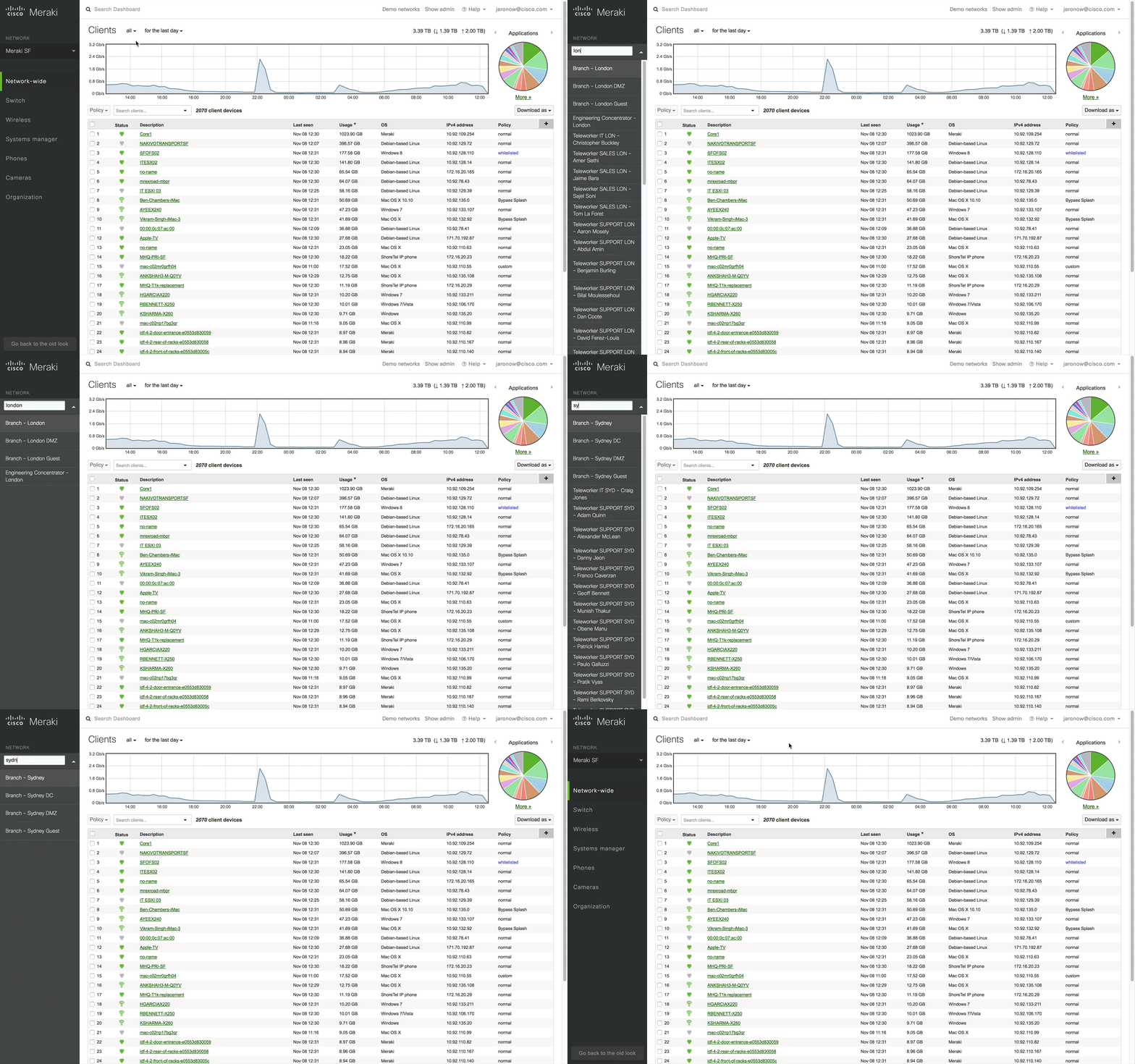
The network selector has abandoned its previous place at the top of the page, and now lives in the navigation menu on the left side. It can be opened by simply clicking on the name of the current network. Combined with the fixed position of that menu mentioned above, that means you can easily switch between networks from anywhere in Dashboard. When you open the network selector, a text field will appear above your list of networks, allowing you to filter the list to quickly find the template or network that you are looking for. There’s also a ‘View all networks’ option that takes you directly to the Organization > Overview page.

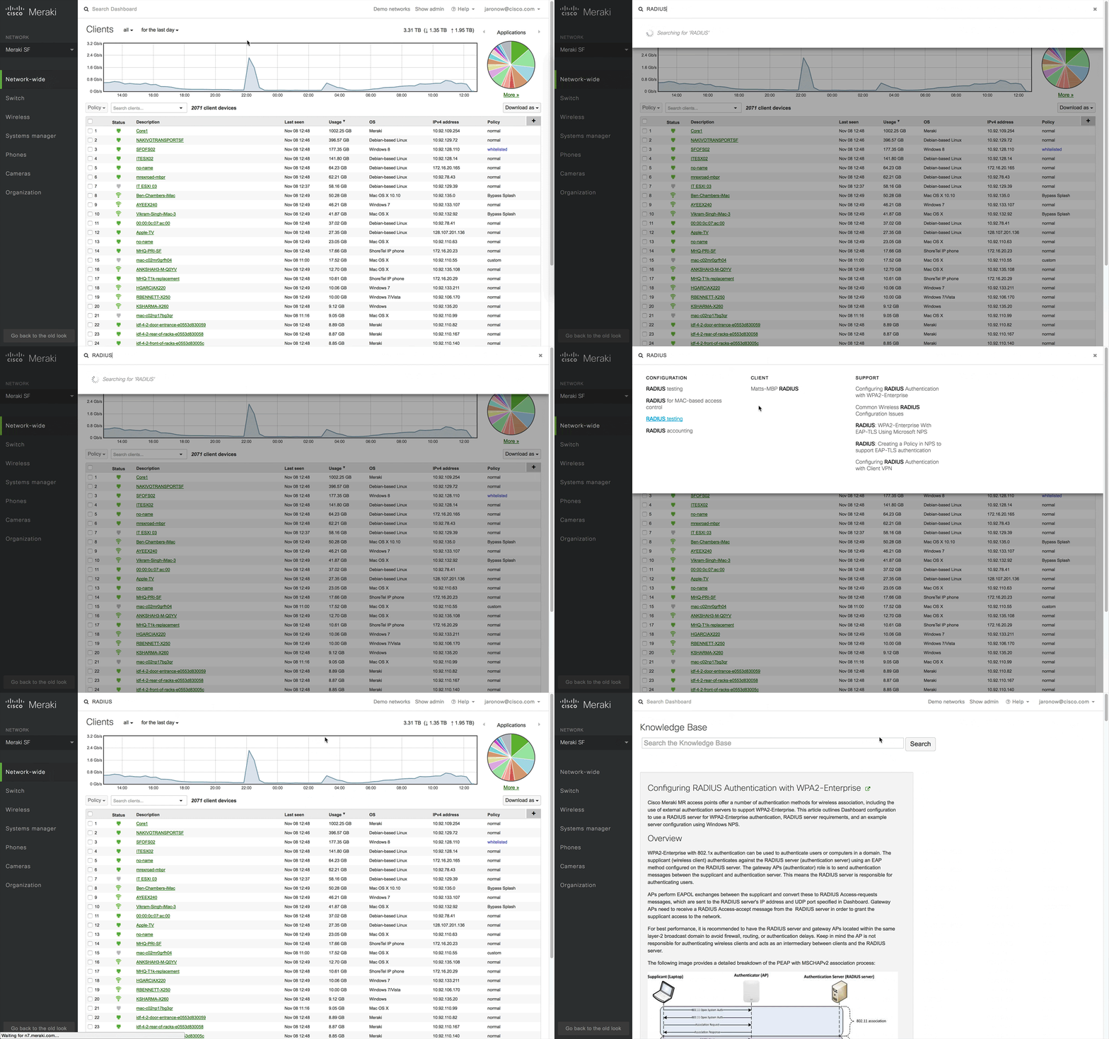
Dashboard’s search function has also undergone a complete overhaul. With the network selector no longer at the top of the page, we’ve expanded the search into the space it formerly occupied – turning most of the top of the page into a search field. Clicking on this field will open up an interactive search window that will update as you type to show you networks, clients, documentation, or even configuration fields in Dashboard that meet your search criteria. To make things even easier, you can open this search bar from anywhere in Dashboard by pressing the forward slash button (“/”) on your keyboard, rather than clicking on the search at the top of the page.

Over the next few weeks Meraki will be rolling this new view out on an opt-in basis. If you want to try it out, keep your eyes peeled for a “Dashboard has a new look!” notification underneath the menu options on the left side of Dashboard. You can return to the current layout and provide feedback at any time by clicking “Go back to the old look” at the bottom of the new left-hand menu.